Creating a Selection (checkbox) component in Adobe CQ
Section below describes step by step procedure for creating checkbox component in Adobe CQE.g Label :checkbox ,Title:My checkbox ,Group: MyComponents
The component will get created along with the jsp associated with it.

3.We need a dialog ,which will enable us to interact with the user.
For that right click on the component and select "Create Dialog",now
your component looks like something as shown .
4.Right click on the node "tab1" (which is be created as a part of dialog)
and create a node by name "items" and type as "cq:WidgetCollection".
5.Right click on "items" and create node by name "checkbox" and type as "cq:Widget"
6.Add properties to checkbox node
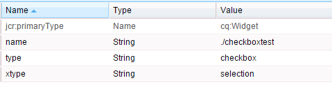
name: "xtype" value: "selection"
name: "type" value: checkbox"
name: "name" value: "./checboxtest"
7. Right click on node "checkbox" and create a node by name"options" and type"cq:WidgetCollection".
8.Right click on "options" and create node "option1" , add properties to the node "text" and "value" with the data required,create required number of options(option2,option3...) Our component is created.
9.We can drag this component in the page.But by default our component will not be displayed in the side kick.To make the component visible in side kick ,select the design mode from side kick .Now click on the edit button available on the "parsys" component of the page and enable the component or component group (Group: MyComponents) by selecting the checkbox.
Now we can drag the component on to the page.
You can display the selected value by adding the line "<%=properties.get("checkboxtext",String[].class)%>" to the component jsp
You can download the code package here checkboxtest-1.0